Worklfow for converting from x,y,z to a 3D object using open source tools

The workflow below will outline the steps taken. Regardless of the type of information provided as x,y,z values, the following workflow will create your 3D object. This is done using the open source Geographic Information Systems (GIS) tools within Quantum GIS or QGIS.

Brief description of the workflow

Users will obtain values for x,y,z and represent those values as points using the values from x,y. The z value will remain in the attribute table and will be used later. Once the points are represented in x,y space, we’ll create a digital elevation model (DEM). This essentially will take the x,y points and interpolate or mathematically guess all of the values between the points while assigning a pixel value to each location from the z attribute table. Typically this z value represents elevation (hence the name of the DEM), but This is typically colour coded in various shades of grey/black/white. The last step will be to use a tool in QGIS to convert the DEM to an STL file, which is a standard 3d object file format that is used for makerbot. This will create the 3D object, which can then be printed using the 3D printer.

Detailed steps:

You have data values that you’d like represent in a 3D space. To display values into 3D space, you’ll need values inputed in x,y and z. x,y will represent your data in a 2D space, while the addition of the z value will add the 3rd dimension. The method outlined below is typically done to display geographic data, but it can also be used with other types of data. The method below will use non-geographic data to create a 3D object file.

The software used in this workflow is QGIS. QGIS is a free open source desktop geographic information systems (GIS) application that allows users to view, edit and analyze geographic information. Users can download the tool for Windows, MAC OS X or Linux at the following website. The workflow below was done using QGIS 2.14.

Create a point shapefile

  1. Collect or ensure that you have a comma-separated file (.csv) with values of x,y,z. This is displayed in a text editor, but it can also be viewed as tabular data. Comma seperated values.

  2. Open QGIS and in the menu, click on Layer > Add Layer > Add delimited text layer… This will allow us to add our .csv file in QGIS Add delimited layer.

You should now see some points displayed in QGIS. You’ll notice in the layers panel on the left that there is a point file. This point file is considered to be a vector feature with its geometry represented as a point. If you can’t see the Layers Panel, select in the menu View > Panels > Layers Panel. In the layers Panel, turn the layer on/off by clicking on the box next to it. Keep in mind that this point file is only temporary and should now be saved properly.

  1. In the Layers Panel, right click on the file and select Save as… and change to the settings as outlined in the screenshot. Ensure that you change the CRS to EPSG 3857 WGS 84 / Pseudo Mercator.

  2. In the Layers Panel, remove the temporary point file by right clicking on the file and clicking remove. You’ll want to have only the pointfilepseudo in the Layers Panel.

Your data is now viewed in 2D space and represented as points. Each point (x,y) has a z value associated to it, even if we can’t see it. You can view this z value by clicking on identify tool in QGIS and then clicking on a point. The underlying attribute table will appear, indicating the value of x,y and most importantly the z.

Create a Digital Elevation Model

Our next step is to fill in the gaps between the points. To do so, we’ll convert the vector point geometry to raster pixels while we use interpolation tools in QGIS to do this. This is quite common in a GIS software, where users attempt to interpolate the elevation of the area with use the spot height points. The output product from this operation is called a digital elevation model (DEM).

  1. In QGIS, click on View > Panels > Toolbox. This will open up the Processing Toolbox window on the right. We’ll be using one of the interpolation tools from this toolbox to create our Digital Elevation Model (DEM).
  2. In the search box, type v.surf. This will bring up various interpolation tools that can be used for your interpolation with the use of GRASS tools. GRASS (Geographic Resources Analysis Support System) are open source tools that can be used in QGIS or as a standalone application. In this case, we’re using the GRASS tools in QGIS.
  3. Double click on the v.surf.idw - surface interpolation by…The idw in this particular case refers to the interpolate method of Inverse-Distance Weighted. This method essentially gives less weight to known points that are furthest when trying to interpolate values.
  4. Fill in the information as seen in the screenshot. The algorithm will process and your output will be added to the Layers Panel.

You’ll see various shades of grey/black/white sections when looking at the DEM raster in QGIS. Each shade of grey represents a different value of z.

Create a 3D object (.stl)

For 3D printing, users must have specific file formats. An .obj or .stl are some of the common formats that can be used to create 3D models. Meshlab is a free tool that can be used to view and convert between multiple types of 3D object formats. In our particular case, we’ll be printing our final 3D object on a makerbot printer. We’ll need the file format to be in .stl. Luckily for us, QGIS can export directly from a DEM to STL file.

  1. In QGIS, click plugins > Manage and Install Plugins…
  2. In the search box, type DEMto3d. This should bring up the plugin that’s required for our conversion. Click on the plugin and install it. Exit the plugins menu when complete.
  3. In the QGIS menu, click on Raster > DEMto3D > DEM 3D Printing. Select the InterpolateIDW layer and the remainder of the settings as outlined in the screenshot below. Once complete, click on Export to STL. Once prompted to save the file, select the appropriate directory.

This will export an stl file that is rather large in file size. This stl file can be used to print a 3D representation of the model or can be used to view the model as an augmented reality object.

Read More

Setup StoryMap Js to use Gigapixel Image

The following will give detailed instructions on how to setup your gigapixel image for use in StoryMap js. The use of the gigapixel in storymap js allows the user to take any high resolution image and use it as a background image to tell your story. When we say high resolution, we typically mean a minimum of 5000 pixels on either the width and the height. Below are the steps taken to achieve this. The steps below also use free open source tools.

  1. Download, export, find or acquire an image that has a high resolution.
  2. On your computer, find the GIMP application. If you don’t have GIMP, visit the GIMP website for downloading and installation instructions.
  3. Once installed/found, open GIMP.
  4. Click on File > Open… and navigate to your image to open in GIMP.
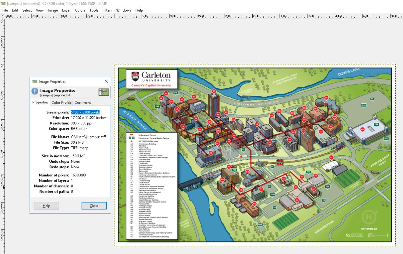
  5. Once the image is open, click on Image > Image Properties We’re looking at a minimum 5000 pixels on either the width and the height. The higher the resolution, the better!!

GIMP checking image resolution

  1. Write down the Image Resolution. In this case, it’s 5100 x 3300 pixels

Now that we have our image resolution, we’ll need to create tiles at various zoom levels from this large image, so that it loads faster in StoryMap js. This is the same method that is used in Google Maps. In this example, we’ll use zoomify to create these images.

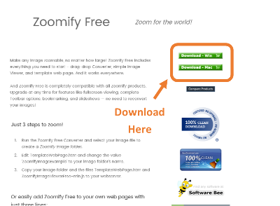
  1. Go to the Free Zoomify Website to download the application.

Zoomify Download

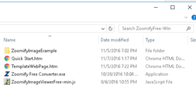
  1. Once downloaded, unzip/extract the file. The contents should look like this.

Contents of Zoomify

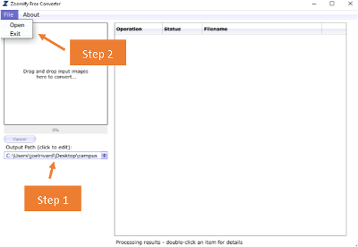
  1. Double click on the Zoomify Free Converter.exe. This should take you through the process of creating zoomify images from your gigapixel image. This is done in two steps.

    a. Set the output directory of the files. This will create hundreds of small files.

    b. Open the high resolution image. Once you open it, the zoomifying of the images will begin.

Zoomify Image Settings

  1. Once complete (should take a maximum of a couple of minutes, depending on the file size of the original high resolution image). This is what the directory structure should look like. Again, depending on the size of your original high resolution image, you could have additional folders.

Contents of Export

  1. Next step is to upload the contents within the folder to a web server. Make sure you copy both folders and the ImageProperties.xml in the folder. Find a webserver that you can have a URL to use for the StoryMap js application.

  2. The last step is to setup StoryMap Js to use the gigapixel image as the base layer for your StoryMap.

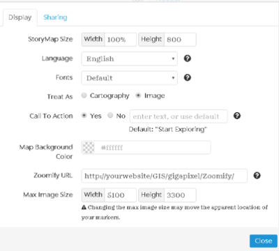
  3. Create a new StoryMap Js and in Options select the following settings in StoryMaps Js. Ensure you’ve got the following settings selected.

StoryMaps Js Gigapixel settings

  1. That should be it! Your Gigapixel image should be the basemap of your storymap. You should be ready to create your story.
Read More

Humans in Space

We were recently asked to give a 1-2 hour session for one of the Enhanced Mini Course Program (ECMP) at Carleton University. Participating students come local grade 7 - 10 schools in the Ottawa area. Myself and a colleague are asked to help out with the course called Humans in Space. Colleagues have helped out with this course in the past, but now its our turn to update the experience for the students.

Read More

Final Reflection

As I write my reflection for this course, I think back at what the world was like before what I learned in this course. For starters, I’d be using Microsoft Word to type up this reflection to ensure that my paper had proper formatting and style. I’d probably be submitting this final assignment to the prof through some course management system such as cuLearn or blackboard, a system that I not only despise but that I find extremely clunky and not user friendly. Instead though, I’m writing this in Atom, saving it as Markdown file and will later be uploading it to my github account where I’ll then be sending a link to my prof through Slack so that he can assess the work that I’ve done for the course. This includes 9 reflections, my notes on my presentation, a final project and this reflection. All of these open to the world (eeekk…watch the spelling I tell myself).

Read More

Using Markdown

The tutorial for markdown language was excellent as it taught us how to separate content from container. StackEdit was a neat tool to use to test out and become familiar with the use of markdown. I had experience using some html in the past, but had never heard of markdown. As great as HTML is, it is a little complex to use when trying to write webpages from a text editor. Markdown has the added benefit of having very little syntax or code. It also has the extra benefit of being able to easily transform your markdown files to a pdf, word document or an html webpage. The use of Pandoc makes this transformation painless and easy to do. In addition to Pandoc, users can post their markdown files in Github and have them quickly served to a webspace.

Read More

Palladio

The tutorial that we did for Palladio was really interesting and extremely easy to follow. It allowed me to get a great handle on what can and can’t do. Palladio is an extremely useful tool to visualize and interact with your data to visualize patterns in your structured data. This, of course, requires that you’re data is structured, where specific patterns can be visualized and explored. Depending on what you have as part of your data, there are various tools that users can harness to explore their data.

Read More

Data Visualization with Online Maps

I was really looking forward to the mapping component of this course, so I thought I’d take a bit further than what was expected of the tutorial and explore varoous mapping methods. Mapping is an extremely component of visualization of data and there are so many different tools that can be used. For my final project of this class, I’ll be developing a game that would allow users to systematically discover which mapping tools to use for users’ research projects.

To experiment using various online mapping tools, it was decided that I would use the same dataset for each online map that I produced. The dataset used was a combined dataset from the csv files from the Federal Heritage Designations database.

A column was added to the csv file to indicate the type of heritage site (historic sites, historic persons, historic events). There are a little over 2,000 records. I cleaned-up the dataset a bit to remove any extra field. This dataset has street addresses (very messy, didn’t clean it up), cities, province and lat & longitude - so we have lots of geographic markers to map the data, all at various geographic scales. Latitude and longitude is typically the easiest to use, depending on the platform and the granularity that the user is seeking.

CartoDB

The first mapping tool used is called CartoDB. Users need to create a free account to make a in map in CartoDB. Users also have the option to purchase a premium verison of CartoDB that allows them to do more advanced mapping. The following maps were created using CartoDB.

CartoDB Map: Categories by Type with Staman basemap (lat, long mapping)

For more information on using CartoDB, check out this tutorial

Google Maps

Using Google My Maps, I uploaded and created a similar map. There isn’t as many options for basemap and there aren’t as many tools to customize our map, but all in all, still a decent looking map. I used latitude and longitude to map the data. Link to My Customized Map

ArcGIS Online (created with public account)

The next tool attempted was the ArcGIS Online Public Account. I’ve signed-in using my gmail account was able to create a map comparable to what was created using CartoDB. The map was created using the latitude and longitude fields. Users can easily map the points by categories. Users can also customize the info pop-up box and select the desired fields to show up in the pop-up box. There are also various templates or story maps templates that can be selected to create the map. Below is the example that I have with the use of point data.

ArcGIS Online (create with Carleton account)

The following map was created using ArcGIS Online, which allows a whole bunch more functionality, but typically at a cost. There is a free version of the software, but which has limitations. It’s also typically best to use ArcGIS desktop to publish maps to ArcGIS Online. There are ways to get around that, but for the purposes of showing various types of online mapping tools, we won’t get into that. The following is an example of an online map that was created for the recent Canadian election. The swipe tool allows you to swipe and compare the political affiliation of the newly elected member of parliament (MP) with the previous MP.

Honourable Mention?!?

I also tried the following mapping tools, but they proved either too complex for basic mapping or just didn’t work. Some would be worth further exploration if users wish to have more complex functionality.

Bing Maps

Let’s first start with Google’s main search competitor, Bing. At one point, Bing would allow users to create customized interactive maps, with the use of its “My Places” section, that being equivalent to Google’s “MyMaps”. Here was a tutorial that would allow users to go from Google to Bing. After a bit more digging, it appears as though Microsoft is focusing on creating maps for Bing with the use of their standard desktop products. So, having said that, we’ll move on to our next product.

WorldMap

Developed by Harvard University, this WorldMap product has tremendous potential, but it requires that users import layers that are already in a GIS format (shapefile or tiff image). For this reason, I’ve excluded it since users can’t easily plot latitude and longitude data. Users who are familiar with GIS layers can explore this product. WorldMap is also a decent product for georeferencing scanned maps with the use of their MapWarper application.

Mapbox

Mapbox is one of those tools that is more meant for those familiar with coding. There are a tone of unique basemaps to play with and it allows users to import their data as latitude and longitude, where users have to set the title, description, colour and feature symbol of the point. For the free version of Mapbox, it seems to limit the import of 2,000 points using the latitude and longitude geographic markers. If you’re looking for a truly customized map and you’re more familiar with graphic design, this might be a good place to start.

Geocoding

If you’re data doesn’t already come with latitude and longitude, feel free to use some these tools below to obtain your coordinates. All of the tools below will require you to use one of the following APIs.

  1. Bing Maps API
  2. Google Maps API
  3. MapQuest Open API

Please explore the APIs to have a better understand of their limits (how many points it can geocode). The one that I prefer (as of March 2016) is the bing maps API.

Online Tools

Online tools should be used to geocode up to a few thousands only. If you need to geocode more points, please see the desktop methods below.

GPS Visualizer

GPS Visualizer requires that your data for the address be in separate fields (address, city, province or state, country, postcode).

Users can use the simple geocoding method (using a postal code, city, province/state, country). Users won’t need an API and it might take a bit of time to run. Also, ensure that you have the following field names

Users that need to geocode data at the address level (1125 colonel by drive) can do so with this mehod. Users can geocode with the use of either of the 3 APIs (as mentioned above) and you’ll be copying and pasting the data. This typically works for when users have up to 2,000 points.

Google Fusion Tables

Google Fusion tables can geocode by Town/City, province or countryLoad data in Google Fusion tables. Google Fusion tables can geocode by address, postal code, town/city, province or country. It will take the data and map it for you on a google maps. However, it doesn’t provide the actualy latitude and longitude automatically. Please see the University of Toronto Google Fusion Tables Tutorial

Google Spreadsheets Users can also try using google spreadsheets to do some geocoding. Try the following instructions and macros to get the latitude and longitude of data.

  1. In Google Sheets, go to >Tools>Script Editor

  2. Copy the contents of the script into the script editor (replace all contents)

  3. In the script editor, go to > Publish > test as add-on. Select the sheet in which you want to use this script

If done correctly, you’ll now have a ‘Macros’ tab in the Spreadsheet menu Highlight the location, latitude and longitude columns for all rows that you want to geocode (location should have information entered, latitude and longitude should be empty.

Run the Macro script - unless there are problems, the lat/long fields should propagate.

OpenRefine Download and install OpenRefine. Open up the software and ensure that your address is all in the same field (1125 colonel by drive, ottawa, ontario, Canada). Users will be required to create a new column and using Json, extract the latitude and longitude using either the Google Maps, Bing Maps or Mapquest api to do your geocoding (see above links). The following OpenRefine to Geocode your data tutorial explains this process. SP: I wasn’t able to make this work, yet :)

Geocoding with QGIS

QGIS desktop is a desktop solution to geocoding when you have over 2,000 points to geocode. Again, you’ll be using the same 3 APIs as mentioned above (Bing, Google and MapQuest) to do the geocoding. As there is already wonderful documentation on this, please follow these instructions on geocoding with QGIS

Remember that each geocoding method has its limits and different levels of accuracy. Explore using all 3 geocoding APIs.

Read More

Cleaning up data with OpenRefine

In the past couple of weeks, we’ve begun to take unstructured data such as text from historical databases and convert it to structured text, for later analysis using spreadsheet software. We’ve looked at how to automatically download these datasets (wget) and we’ve begun to clean-up some of this data by using regular expression commands. We’re also looking at the OCR process of documents and issues of what happens when OCR is applied to scanned text. The next step in cleaning-up data is done with the use of OpenRefine, a product that allows users to easily clean-up data with in a multitude of ways. OpenRefine is a really good tool that can easily consolidate data, remove blanks, convert formats of fields (from text to numeric and vice-versa), trim leading and trailing spaces, defining that characters be either lower or upper case and many more just by the click on a few buttons. While some of these operations seem a little trivial, when they are done on a large dataset, they become an extremely important step to do before proceeding to the next step.

Read More

Introduction to bash and unix command lines

This tutorial introduced us to various command line commands that are common in windows or an OSx environment. The writers do an excellent job of introducing and explaining the various commands that can be used with the command line.

Read More

Using the Zotero API

I looked at the following 2 Zotero tutorials to get a better sense of how an api works. The initial tutorial allows users to connect to bibliographic information stored in zotero by using the zotero api. This allowed the user to retrieve and create or add content to a new or existing library of bibliographic information. In the initial exercise, we were able to connect to a specific database and retrieve information such as the item type and various other bits of bibliographic information to have a clear sense of what was being done with the use of the python scripting.

Read More

Automated Downloading with WGet

This little awesome tool is pretty great for quickly downloading various bits of the internet for research, preservation or archival purposes. As an information professional, the initial python tools and modules helped me identify and make my shopping list of stuff to download, while the wget tool allows me to download content from websites. This has the capability of being a huge time saver for information professionals and or researchers looking to download many files for their research or collection. This would have been extremely useful to use a few years ago (and it may have well be used by individuals) when several federal government departments changed their websites and various bits of information disappeared. There are few ways in which this can be used to download a many files.

Read More

Data Mining the Internet Archive

I learned some of the basics of python over 5 years ago in the context of using it in a Geographic Information System (GIS). At the time, I learned it while using a windows-based computer. I was told that python was a powerful programming language, but since we only used it within the confines of a GIS , I had never truly discovered its usefulness outside of this world…until now, through the programming historian. As I look through these examples through the lens of an information professional, I can clearly see the advantages of being able to search through various collections in internet archive with the use of a programming language. With the use of some of these python modules and scripts, information professionals can extract various bits of information from collections held in Internet Archive, quickly and easily (well, after the setup is complete that is).

Read More

Library Research Journals

The following illustrates various research journals in the Information Science profession. When doing research, these research journals are invaluable in the research process.

Read More